Tag

website design

website design

Five Online Firearm Marketing-Mistakes To Stop Repeating Today

Five Online Firearm Marketing Mistakes To Stop Repeating Today

By Firearms Marketing

Albert Einstein once defined insanity by doing the same thing again and again and expecting different result. While he probably didn’t have online marketing in mind at the time, his quote is as relevant to the business owners we work with as it is to any physics professor in the country.

The point here is that there are thousands, of firearm business owners and executives out there right now who keep repeating the same internet marketing blunders repeatedly and then wonder why they aren’t getting better results. These errors can take a lot of different forms, of course, but there are a few we see every week.

To help you from making or repeating them, let’s look at five online marketing mistakes you should stop repeating today…

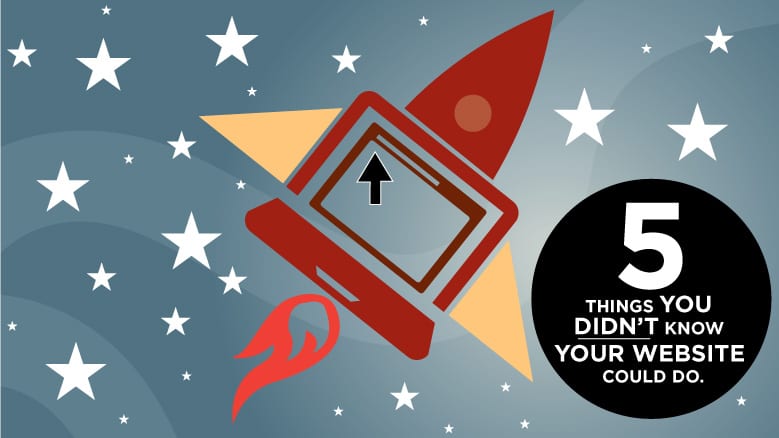
1. Ignoring Your Website
You don’t have to do a lot to your website to keep it running, but you can’t completely neglect it, either. Looking after things like updates (to your content management system and plug-ins) and adding new articles or pages can keep your site relevant and secure. Additionally, you should schedule a website audit 2-3x a year so you will be aware of any underlying programming issues that could slow your pages down, cause security concerns, or lead to error screens. Consider taking a growth-driven design approach to your next website design process. 

2. Only Posting Promotional Updates or Press Releases
Obviously, you want to use your website to promote products. However, that doesn’t mean your customers want to read nothing but promotional messages. Avoid turning your blog into a PR dumping ground. Knowing that, smart marketers will walk a fine line, giving fans and followers a steady mixture of information, entertainment, reviews, and offers to make a purchase. It doesn’t matter whether it’s your email newsletter, your social feed, or any other online channel: don’t just ask people to buy from you every day—provide value, be helpful, make people stop and think.

3. Taking Content From Competitors
We are continually amazed at how many marketers think they can get away with borrowing things like content, images, logos, names, video, and other materials from their competition. Even if the source material is slightly altered, using something that has been copied from another company is bad for your business. It opens the door for other business owners to sue you, customers to ignore you, and Google to blacklist you from the search engine listings. Don’t use content if you don’t own it.

4. Dismissing Negative Feedback
You will never be able to please 100% of the buying public all the time. And, those people who are most annoyed with you also happen to be the ones who are going to leave negative reviews, so you shouldn’t take everything to heart. However, if customers are complaining about the same things again and again, don’t dismiss their feedback. Every review is an opportunity to learn. If you don’t take that opportunity, it’s going to hurt your business.

5. Paying for Lackluster Results
Some business owners will pay online marketing invoices for months or years, even when they aren’t getting the results they expected, simply because they don’t know what else to do. But, that’s not the way you want to run your company, and it isn’t going to lead to positive growth. If you’re getting lackluster results from your online marketing campaigns, or no results at all, think about switching to a more accountable vendor.

Influencer Marketing Metrics Firearms Industry


Time to Turn Your Website into a Business Asset?
If you feel like you pour time and money into your website without getting much in return, this is your chance to set your business on a new path and get one step ahead of your competitors. Contact us today so we can set up a free consultation to evaluate your strategy together and find an affordable and effective way to boost your online marketing results.

hunting-firearms-best-website-design

The Hunting and Firearms Industry’s Best Website Designs

By Firearms and Hunting

What makes a great website? Most of the time you know it when you see it, but you just can’t put your finger on it. To have a website that stands head and shoulders above your competitors, brands must focus on creating engaging user experiences. To do so, here are ten points to keep in mind: 

  1. Design for your buyer persona
  2. Less really is more
  3. Use interesting colors and quality imagery
  4. Make sure it works on all mobile and tablet devices (responsive)
  5. Gives users something to “stick” around for like a blog, videos or other forms of helpful content
  6. Write content in your buyer persona’s language
  7. Make your content easy to share
  8. Optimize for search engines
  9. Add an SSL for extra security if you’re running a shopping cart
  10. Must load in under 5 seconds

Earlier this year, Google announced that if your website was not mobile friendly—or in other words “responsive”, you could be penalized in search rankings. And with more than 95% of all product searches starting online and more algorithm changes on the way, it’s important to take advantage of these changes to make sure your website will remain competitive. One way most hunting and firearms websites are ensuring their survival is by adopting content marketing. By creating consistent content in the forms of blogs, videos, whitepapers and downloadable offers, companies can keep on top of the search engines and provide a “branded” user experience to their users. This is a significant trend away from which historically has been left to content publishers like Field and Stream, Guns & Ammo and others.

In this post, we looked at over 200 websites in the hunting and firearms industry and chose one from 25 categories to see how the industry is moving forward by adopting the latest web trends and technologies. Last time I checked the Webby’s  (Website awards) weren’t giving any awards for brands in the hunting, outdoor and firearms industry, so we hope to change that with this post. 

Use this post to gain ideas for your own website or to get inspired. 


Accessories
Magpul’s great products combined with stunning imagery and their unique sense of humor reflects perfectly on their brand personality.

magpul


Ammunition

Barnes does a great job with imagery and creating some interesting features like their load data and information page. They also feature their community members that adds to its credibility and “social proof.”

barnes


Attractants
Big & J’s website uses great imagery and product callouts.

bigj


Blinds (and Tree Stands) 
Muddy’s website has a lot of engaging imagery and a full-screen interface that makes for a clean user experience.

muddy


Bows
Bear Archery does a great job using “parallax” technology on their page scroll and telling the story of their products. Along with clever imagery (see hunter in the sky) this site makes it fun to scroll.

bear


Clothing
5.11’s firearm accessories website does a great job of communicating quickly their large line of apparel and accessories and helps the user get to where they want to go quickly.

5.11


Coolers
No surprise here. Yeti’s website is also very clean and does a great job with text and imagery to convey their brand’s messaging. Thier “Field Notes” blog provides great recipes and how-tos on cooling game along with other interesting content.

yeti


Decoys
Bigfoot Decoys website uses really great imagery and a simplified navigation menu. Check out their dealer locator.

bigfoot


Fitness
Not only is Mountain Ops an interesting newcomer to the hunting industry, its products and branding are very persuasive as redefining hunters as “wilderness athletes.”

getmntops


Food Plot
Packed full of information, BioLogic’s website helps users figure out what products to use and provides relevant information about their products.

biologic


Handguns
Springfield Armory’s website is very clean and utilizes a good amount of whitespace. Packed with great video content, blog and reviews, the site does a great job using graphics and content to educate its users.

springfield


Game Calls
Knight and Hall gets honors in the game call category. They also have a great blog packed with calling tips and other great hunting information.

knighthale


Game Cameras

Wildlife Innovations combines their celebrity lineup with their line of innovations. Real faces of real people make it interesting to look at and scroll through.

wildlifeinnocations


Game Feeders
On Time’s brochure-ware site is super simple in look and feel and does a great job of communicating the brands products. If you have a low budget, this is a good example of what can be done.

ontime


Gun Cleaning
Although the Hoppe’s website is not responsive, it was still the standout among its competitors. This heritage brand does a great job of bringing its brand into the 21st century.

hoppes


Holsters
Interesting imagery and typography makes the Blackhawk! website very engaging. We also liked how they used vertical imagery to scroll the user down the page.

blackhawk


Knives
Kershaw’s website uses a clean and minimalistic design that showcases its products nicely.

kershaw


Lasers
Crimson Trace’s website uses an interesting type style along with their signature campaign imagery of peoples faces in silhouettes.


crimsontrace


Modern Sporting Rifles
Bring the rain! Black Rain Ordinance does a great job of communicating their unique brand on their website.

blackrain


Optics
Burris uses a unique minimalistic menu function that opens up the page to its great imagery and content callouts.

burris


Packs
Badlands website uses a darker (and meaner) color palette to communicate the seriousness of their brand, combined with their sponsored hunters and shooters makes the site very engaging.

badlands


Patterns
Mossy Oak leads the pattern category. With plenty of great content, interesting design and great imagery, Mossy Oak’s website is engaging and does a great job of presenting their sub-brands (upper left).

mossyoak


Safes
Securit leads the safe category with interesting imagery, persona-based navigation and a great library of content.

securit


Suppressors
Our leading favorite only because SilencerCo. is the coolest brand out there right now, but also because its got our good buddy Jep on the home page. Their #fightthenoise campaign has been highly effective.

silencerco


Rifles
The winner of our review is Mossberg. With helpful content, amazing imagery, persona-based navigation and a responsive design, you can tell a lot of work went into this website.mossberg-winner-3

If you’ve noticed one thing about the websites listed in this post, it’s the investment in quality photography, graphic design and copy. These three elements combined with solid programming and ease-of-use is only the first step in joining the digital age of marketing. Turn your website into a powerful sales tool by adding useful, helpful and consistent content that helps your customers solve their problems and that answers their most burning questions. 

What do you think of our list? Who did we miss? What was your favorite? Please post your comments below!

google-mobile-update

Why Your Website Needs To Be “Mobile-Friendly”, Like Yesterday

By Responsive Web Design

Starting April 21, 2015, “mobile-friendliness” will be a ranking factor on Google. Confirmed by Google in February—companies that do not have a mobile-friendly or responsive website will suffer ranking depreciation. Is your website mobile friendly, find out here.

Did you pass? If so, you can click away from this article or maybe take a look at the 4 Things Google Wants From Your Website in 2015

But, if your website is not mobile friendly, better keep reading…

I didn’t pass. What does this mean for my business?

If you’re like most busy business owners, you may have pushed your website to the back burner and let it coast for a few years. You may have not seen the importance of blogging or SEO because well, you’ve been busy. It happens.

Decline in traffic

Google’s past algorithm updates like Panda, Penguin and Hummingbird have been catastrophic for some businesses. It’s speculated that this mobile update could have the same effect on brands that have not made the change to a responsive “mobile-friendly” design, but only time will tell. 

If you haven’t made the move yet, don’t fear. If you’re running your website on WordPress or some other mobile-capable CMS’, the change should be fairly painless. You should definitely start making preparations now to upgrade.

Why the update?

Consumer behavior has changed drastically with more than 50% of all internet users accessing the web from a mobile device. (Source: Smart Insights) How can this be? Think about it for a moment. When you’re in a store, you may pull out your phone to compare prices of the same product from other stores to make sure you’re getting the right price. This is called “showrooming.” Or if you’re traveling and search for a nearby restaurant—you go to Google. And not to mention that if you walk down any street in America, you’ll see people’s heads buried in their iPhones. What’s also amazing is that 90% of all interactions per day is done through a screen of some sorts – 38% by mobile (Source: Hubspot).  And with the trends of wearable tech and more go-go gadgets on the way, you can be sure that mobile will become the norm from here on out.

Check out the latest statistics that validate Google’s Decision:

  • 57% of users won’t recommend a business with a poorly designed mobile site (Source: Mobile Playbook)
  • 40% have turned to a competitor’s site after a bad mobile experience. (Source: Mobile Playbook)
  • By 2017, it is predicted that 85% of the world will have 3G coverage (Source: Ericcson)
  • There are almost 1.2 Billion users in China (Source: Statisa)
  • 56% of American adults are now smartphone owners. (Source: Pew Internet & American Life Project, 2013)
  • 75 percent of Americans bring their phones to the bathroom. (Source: Digiday, 2013)

Needless to say, mobile is here to stay. Don’t let all your hard work of blogging, search engine optimization and investment go to waste. Contact us today to learn how to best prepare for this update.

10 Secrets to better home page design

10 Secrets To Better Home Page Design

By Web Design

With only 3-5 seconds to capture your website visitor’s attention, your company’s home page is one of your most important pieces of brand real estate.

If you’re a business owner (or marketer), knowing the secrets to effective home page design is critical to success in the realm of inbound marketing. In this article, I’ll give you the recipe that will help you design a better home page that will decrease your bounce rates, improve customer conversions and improve your brand’s digital impression. 

To begin, there are 5 overarching secrets to building a better home page.

1. Cognitive fluency
home page web designCognitive fluency is simply a measure of how easy it is to think about something, and it turns out that people prefer things that are easy to think about to those that are hard.

Google researchers found that users judge a website as “beautiful” within 1/50th – 1/20th of a second. “Visually complex” websites are consistently rated as “less than beautiful” as their simpler counterparts.

Let me an illustrate an example. Have you ever gone on a blind date?

As soon as you open the door — you’re able to within 1/50th of a second determine if the person standing before you is attractive or not. 

Websites work a lot like a blind date. You punch in a keyword not knowing what to expect until the page loads—and when the page finally loads—you either bounce away in horror or you pleasantly choose to stay—gazing at the beautiful layout in front of you. 

When designing your home page, simple = beautiful. 

2. Simple navigation
Simple navigation keeps the home page clean and gets your visitor to where they want to go quickly. Try to keep your navigation to an absolute minimum. Design your website’s architecture in a way that doesn’t detract from your overall goal. Notice the examples in this article. The examples shown have 3-5 navigation topics max.

Website Homepage Design3. Relevant color scheme
Keep your colors appropriate and in context to your industry. Do you need a dark color palette to convey luxury—or a more lighthearted palette to show approachability? Know what colors are used in your industry for maximum appeal. Find out more about your buyer persona to get an understanding of what will resonate with your target audience.

4. Streamlined next steps
What do you want your customer to do when they are on your website? Download an ebook? Contact you? Map out what you want them to do next. Don’t leave your visitor hanging. Think for them and move them through the buyer awareness stage using strong call to actions (CTA’s).

Now that you know the 5 overarching factors for a successful home page design, now you need to know the 5 elements and how they are implemented.

5. Logo

Your logo design serves as the anchor point for your website and communicates your company’s credibility and trust. Eye patterns start from top left and go down toward the right. An interesting and professional logo makes a great first impression. 

Website-Homepage-Design-Saucony6. Main image = main message

Next is your main image with the main idea that you want to communicate. Your message should be short and succinct. Be clear, not clever. Your imagery should position your brand accordingly and be tied to your main message. The image should be creative and eye catching. This is your chance to “stick” your visitor to your site. If someone hits your site and immediately bounces off, it’s because your message was not clear and they found your site unexciting or irrelevant.

7. Service offerings

Scrolling down—you should now tell your visitors what you offer and how you can help them. Make sure the text is written for them. By accurately defining your buyer persona, you’ll be able to talk their language in a way that grabs their attention and presents the impression that you understand them. This works in your favor to convince them you’re the company for the job.

8. Why work with you?
Next, you want to present the reasons why someone would want to work with you. These should be the top 3-4 things that separate you from your competitors and distinguish your brand. Make the reasons compelling enough and link to the areas of your website for more information and to track engagement.


Website-Homepage-Design-Hubspot9. Social proof
People tend to follow people. By showing social proof that people like you on Facebook or follow you on Twitter can lend real validity to your above claims. If possible, showcase real customer testimonials with faces. This is the icing on the cake for presenting a credible narrative by showing others who you’ve helped.

10. Load time & responsiveness
Users want sites that load fast and that are responsive (iPad, iPhone and Desktop). By keeping your content simple and optimizing your images correctly you can decrease load times. If you’ve hired a web design company to build your site—ask them about load times and if they use content distribution networks (CDN), browser caching and if they will minify javascript and CSS for a faster loading home page. Below are some interesting stats on load times according to MOZ.

  • If your site loads in 5 seconds it is faster than approximately 25% of the web
  • If your site loads in 2.9 seconds it is faster than approximately 50% of the web
  • If your site loads in 1.7 seconds it is faster than approximately 75% of the web
  • If your site loads in 0.8 seconds it is faster than approximately 94% of the web

See how your website stacks up at: Pingdom

In conclusion, knowing the secrets for better home page design will ensure lower bounce rates and attention grabbing messaging you need to move your customer further down your sales funnel for customer conversion. These factors when taken into account will turn your website into a revenue generating machine.


Professional web design

Can Your Website Do These 5 Things?

By Web Design

Perhaps one of the biggest mistakes most marketers and business owners make is that they overlook their website’s true potential. We know that a website is a necessity to do business. We know how our site should function and what kind of information it needs to contain. But a lot of times we don’t quite grasp the importance of how—that with a few changes—our company’s website could be modified to work harder for our businesses.

Below are 5 things you didn’t know your website could do. More than a pretty face —your website has much more potential than you think.

1. Make you look bigger than you are
If you’re a smaller business looking to attract big clients, your website is the first step. In today’s digital world, impression and trust is everything. A website can communicate your brand’s unique message and connect with your prospect. Microsoft Research reports that people spend only 10 seconds on your homepage before leaving if they don’t immediately connect with your marketing messages. With the aid of professional website design and targeted and clear messaging, you can present your company as a reliable, professional partner that keeps your visitors on your website longer.   

2. Generate revenue

Through methods like blogging, social media, CTA’s (call-to-actions), premium offers and landing pages you can essentially create a completely new revenue channel to grow your business. This process, termed “inbound marketing” is a method that attracts, converts, closes and delights customers to grow your business online. This methodology is proven in the digital age and can significantly affect your bottom line. Consider these following statistics:

  • According to Social Media B2B, B2B companies that blog generate 67% more leads per month than those that don’t.
  • The Content Marketing Institute reports that 8 out of 10 people identify themselves as blog readers, and 23% of all time spent online is spent on social media sites.
  • ContentPlus published that blogs give websites 434% more indexed pages and 97% more indexed links.
  •  Search Engine Land shares that up to 80% of people ignore Google-sponsored ads.
  • HubSpot’s research shows that 75% of users never scroll past the first page of search results.
  

These trends show that one way to grow or market your business more effectively is by utilizing an inbound methodology as a way to increase traffic, leads and convert visitors to customers. When these mechanisms are in place, and given time to work— your website turns into a 24/7 lead generator.

3. Build your brand
With the right content marketing tactics, you also can build your brand locally and nationally quicker than traditional advertising and marketing methods. Unless you have 20 million for a national ad campaign to spend, inbound marketing costs 62% less per lead than traditional marketing. 54% more leads are generated by inbound than outbound or traditional advertising and marketing methods. If you are able to generate relevant content that solves your customer problems—and do that consistently, your brand will begin to take root in the minds of your customers.

4. Attract talent
90% of all online applicants will visit a company’s careers page. Data suggests that just because you have a strong corporate brand, doesn’t necessarily mean it translates into a strong employer brand. Websites that have a video that showcases their company’s values and culture will receive more applicants than a company who doesn’t. (SOURCE: LinkedIn Employer Handbook. December 1, 2012) With a strong careers page, your chances of attracting top-tier talent increases.

5. Connect your brand to your customer
Having a professional website design created with your customer or buyer persona in mind can allow you to connect your brand to your customer more effectively than traditional push marketing can. By utilizing your website as the cornerstone in your social media activities you can drive traffic from social networking sites like Facebook, Google+, Twitter and Pinterest that connects your brand to your customers that creates real affinity and preference.  

In conclusion, your website may not be able to cure world hunger or create peace in the middle east, but it can make you look bigger than you are, generate revenue, build your brand, attract talent and connect your brand to your customer. By adopting an inbound marketing methodology, you can turn your website into revenue generating machine and a valuable and effective marketing tool.

If you need help or have questions on how to make your website work harder for you, please contact us.

How Much Does A Website Cost

How Much Does A Website Cost?

By Web Design

I started my first HTML page back in college in 1997 before the internet was ‘thee internet.’  Since then, I’ve architected and built sites for start-ups to public-traded companies with hundreds of thousands of users and yet even in 2014 the question of cost is a tricky one.

    
Here’s why…

Today, I think it’s a fair assumption that most people view websites as a commodity. Due to recent hard economic conditions—that seems to be letting up—small business owners and start-ups can’t afford to spend big money on a website which they see as just ‘a website’. With the bad economy brought the emergence of crowdsourcing and discount website building companies. Websites now have a terrific low barrier of entry—with little differentiation in how they function which has brought the perception of their value down.

Savvy companies and brands know that their website is an invaluable marketing and sales tool that allows them to achieve their sales and marketing goals. It supports their marketing and sales efforts and provides assurance to their customers and employees in the form of innate trust. Through social media, content, video and imagery, modern companies understand that the look and feel of a website is just the first step in a broader strategy.

Below I’ve compiled 4 things to help you understand how and why a website is priced and what separates the free websites or discounted website builders from a true marketing tool that transforms your business.

1. Start with your goals
When we start with a new client the first thing we ask is: “What are your goals?” Is your goal just to have a great looking site with great pictures and products and photography or do you really want it to be more than a pretty face? Today, having a website is just the first step. That free website you started and launched a few months ago isn’t enough to build a business or a steady stream of revenue in today’s digital landscape. Businesses must adhere to a specific set of standards, rules and best practices if they hope to ever be found online according to Google’s recent algorithm changes. If you can’t get found, then what’s the point of having a website? Sure, you can have it on your business card and point your customers/clients to it, but in today’s competitive environment is that enough?

If your goals are to increase traffic, there are ways to do that through blogging, social media and search engine optimization. If you want to generate leads, there is a process that creates offers your visitors can’t resist; offers so good that they will gladly trade their contact information for your offer that allows you to continue the conversation. If your goal is customer acquisition, there are methods through things like workflows and lead nurturing that can be utilized to move a potential buyer further down the sales funnel to the close stage. All of this begins with your goals. Design and functionality should be built around your goals and not a cookie-cutter, one-size-fits-all solution.

Bottom line:

  • Research
  • Traffic generation

  • Lead generation

  • Customer acquisition
  • Search engine optimization
  • Content creation
  • Social media management
  • ROI analysis and reporting
    COST = $500 – $15,000/mo. (depending on how fast you want to achieve your goals)

2. Build a solid foundation
Once your goals are set and we know what kind of website you want to build we start with building a strong foundation. There are numerous platforms and applications out there to build a website. You can even start with a blank html page and start building one from scratch. Each are different and come with a set of standard features and functions. Names like Drupal, WordPress, Joomla and Expression Engine come to mind. We use an open source platform called WordPress. WordPress comes with a basic content management system and thousands of free plugins that function like apps on your iPhone. Plugins add extra functionality to a WordPress site like spam blockers, newsletter signup forms, contact forms, maps, buttons, sliders, Facebook feeds and more. It’s also one of the easiest platforms out there for our clients to use—which is why we use it—and it’s for a great price (FREE!). Hosting is also quite cheap to come by. We host with Rackspace Cloud that provides our clients with a cost–effective hosting solution backed by Rackspace’s fanatical support guarantee.   

Bottom line:

  • WordPress: FREE
  • Hosting: $4.99 – $14.99/mo.
  • Domain: $9.99
  • Premium domains: $50+
    COST =$4.99 – $100

3. Design, integrate and optimize to get found
You can go out and by a theme for WordPress for around $40. However just plugging in a theme assures your website will look like a thousand other websites out there. We offer two cost-effective options that take a theme as a base design and modify or “skin it”. “Skinning”
 means taking a native theme design and customizing it to your brand’s unique look and feel. This way the theme takes on a completely different look while customized to your specifications. If you were to build a website from scratch, or through a base code program like Bootstrap the costs would top into the tens of thousands. Fortunately today, small businesses have the option to start with a theme and modify it to match their desired look and feel for a reasonable price.

Additional design costs begin to incur in the form of content. Content can be anything from written text, custom graphics, buttons, background patterns and more. All these add to the time and effort the team must put into the project. You may need diagrams, a video, or downloadable collateral to help customers understand complex products or services. All of this will need to be taken into account.

Then comes photography. No one EVER wants to invest in photography—which is a shame. You basically have the choice of buying quality images or low-quality images. High-end stock photo sites like Getty and Corbis start at $250+ each. Mid-grade sites like Veer and Jupiter start around $50+; and low-quality sites like Shutterstock and iStock prices start at $5+. However the quality shows. Cheap images don’t add visual value to your website and they look cheesy. Most visitors will pick up on this and leave and forget your site ever existed. Photography is always a huge line item in any web project. So be prepared to invest to make your site look polished.

At the end of a professional webdesign design process you also will need to optimize the site for your keywords. Search engine optimization consists of having relevant title tags, descriptions, image alt tags, on-page links and inbound links all based on the keywords someone would punch in to find you. Google accounts for almost 90% of all search traffic so everything is typically geared toward their requirements.

Bottom line:

  • Theme = $40
  • Customizing (Skinning) = $1,500-$2,000
  • Custom graphics = $800-$1,200
  • Photography = $500
  • Good photography = $1,000
  • Search engine optimization = $400
  • Content creation (provided by web company): $1,500-$2,000
    COST = $40 – $10,000

4. Have a back-up plan
After the site is launched the site isn’t over. Websites should not be viewed as a “one and done”. Now you have to factor in the possibility of any malicious attacks, customer service problems, billing errors etc. that add to the costs of maintaining the site. Most sites can go for years without any major issues, but you will need to keep someone on hand who can address any required updates and any other issues if they arise. The old saying: Anything that can go wrong will go wrong —is true. I can’t tell you how many times we’ve had clients going into a meeting and their website goes down.

Bottom line:

  • COST = $0-$1,000/yr.

To wrap up, pricing a professional website is a very difficult thing to do. As a small business you are trying to cut costs and do things right. You have to start with your goals and work backwards on what you have to spend.  Only by setting goals that are SMART: specific, measurable, attainable, realistic and timely can you accurately quantify ROI and what a realistic investment is.

6 Reminders Why (or why not) Your Website Rocks

By Web Design

shutterstock_11682370So you just launched a new website. The site looks great, functions as it should and the whole company loves it. You’ve had great feedback from customers and the rumor is the board members are also impressed – all is good in the marketing department today. Good job! But just in case you have forgotten about the initial goals and objectives, here are 6 reminders why your new website is rock’n!

1. You have an amazing careers page
People are like gold and are your most important asset. This important section of your site should be shared with marketing and HR. The best career pages have videos that present some aspect of the company other than work. By attracting and hiring the right employees you will create a better company culture. You’ve given your employees purpose and a reason to get out of bed every morning to come to work. They are empowered to generate ideas and innovation is so thick it’s flowing from the water fountains. Your people are the key differentiator in a marketplace full of identical competitors™.

2. You write specifically for your customers
You’ve spent some time figuring out who your target market is and you’ve pegged three buyer personas that you have based all your content around. When potential visitors hit the site, they are drawn in and stay there. Low bounce rates baby!

MOBILESTATS3. You’ve made it responsive
Since over 20% of all website are viewed on a  smartphone or tablet  and climbing – you’ve created a responsive website that allows users to see content on multiple devices. See some other interesting mobile more stats to the right.

4. Every page is optimized
The old adage goes, “unseen is unsold”.  Every page is optimized and indexed by Google. Your keywords have really gained traction and are passing on important leads to your marketing team for qualification.

5. Every page is like flypaper
Every page on the site uses succinct phrases and larger type with big beautiful graphics. Graphics are easier to scan and easier to understand. Most people’s attention span is less than 10 seconds. You must get your point across quickly and engage your visitor and you’ve done that. There is also some videos that allow visitors to watch about your latest product feature.

6. Strong call-to-actions and lead nurturing
Every page has a CTR (Call to Action) and a mechanism in place to pass on quality leads to the sales team. You created the website in this way to reduce costs on lead generation because cultivating leads online can save your company money and make your sales funnel much more cost-effective.

Is your website still rocking?

Today, with so many aspects of digital marketing changing it’s somewhat impossible to keep up with best practices for web. Contact us today for a free consultation on your website and how to make it rock!